And we are…BACK. Happy Fri-YAY, friends. Obviously, we’ve been “here” the whole time, but the market notes have been on hiatus. For the couples and couples of people that normally read these random musings, many apologies. For anyone new, welcome. We will be on a more regular schedule for the back half of 2023 as we prepare for two exciting things in 2024: sometime around the end of the year, Your Dear Author is expecting baby #2 (fun). Adding to that excitement, we get the gift that only comes once every four years – a Presidential election campaign! Oh boy. Before everyone stops reading at the mere mention of the election cycle, we will shelve that topic until later in the Fall and get caught up on what we have missed and where the financial markets stand today.
There are some fun and interesting tributaries to explore in this year’s financial news, but the main story of 2023 is fairly straight forward. Inflation has cooled. It’s not where the Fed wants it, but it’s manageable. Interest rates are “high” compared to where they have been in the last forty years, but they have mainly stayed at the same level (futures markets are predicting that the Fed is basically done with interest rate hiking). Some analysts believe that as soon as the rate increases stop, the Fed will quickly start cutting rates. We aren’t so sure. If the economy or stock market show signs of weakness, they might step in with cuts, but as long as things look positive, this rate regime should be here to stay. And overall, things have been mainly positive.
Stock indices made 52-week lows in October and have been positive since. In the first quarter, it was the titans of technology leading the way as they came back from a bad year in 2022. Generally speaking, 2023 has been the inverse of 2022. Sectors like health care and energy that were very positive last year, struggled do anything in the first half of the year. Or so has been the story this year until the last couple of weeks as we have begun to see the largest technology companies starting to roll over. As you can probably guess, that means that health and energy are starting to do better again. We will touch on why and what that all can mean but first some pictures.
This is a chart of the Technology Sector ETF, XLK (this fund includes all American large tech companies with Apple and Microsoft being the two largest). If the busyness of the picture makes you want to turn away, hang in there for a second and we will explain. What you are seeing is this ETF’s performance over the past five years. We have noted the “October lows” and “July highs” in pink. The grey line running across is simply showing that when the sector recently peaked in July, it was simply getting back to the level it achieved at the end of 2021. That’s a nice little recovery innit, but what we really want to see is for it to make those new highs and then hold them. That hasn’t happened hence the “oops!” noted in blue on the chart. Ever since it crossed that previous high, it’s pulled back.
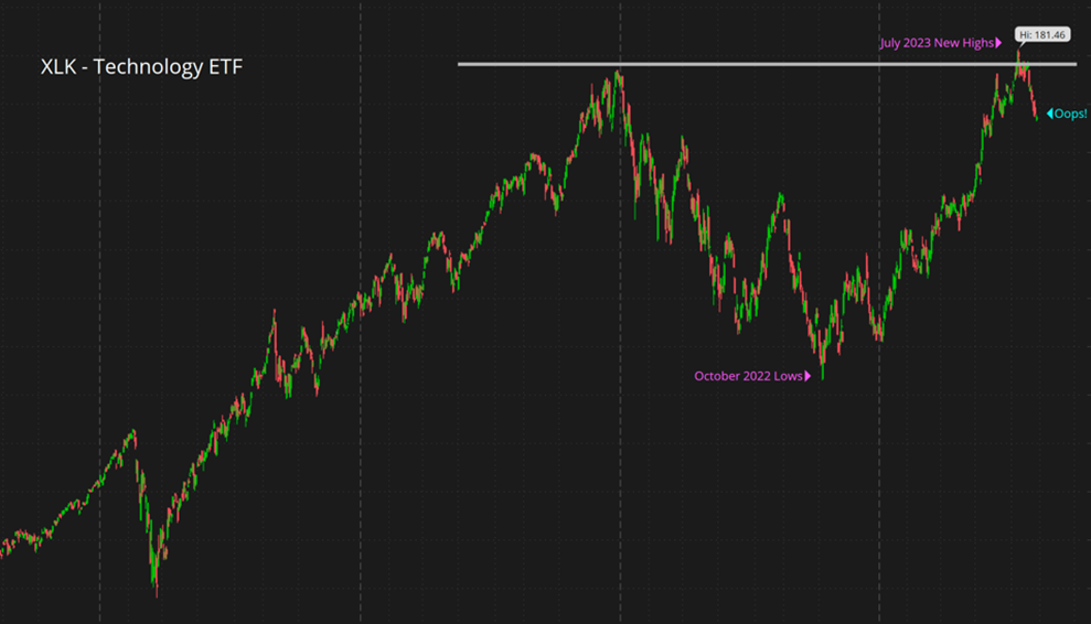
You’ve most likely heard us say something along the lines of “timeline matters” and that’s very true here. When we try to make sense of this chart, it’s really a tale of two periods. In a shorter-term like six months, this doesn’t look positive. Think of the grey line as a ceiling that is in the way. However, when the investing timeline is longer-term, like five-to-seven years, this means very little. If anything, it shows that technology stocks could be stuck going sideways and may provide buying opportunities with that longer-term goal in mind.
As technology has recently stubbed its toe, health care and energy are showing signs of life. At the moment, the second half of 2023 is setting up to be more like 2022 with tech on the struggle bus while health care and energy lead. This can only lead to the one clear and obvious conclusion: “time is a flat circle”. Kidding! (I still don’t even know what that means to be honest). The real takeaway is that for the overall stock market to go higher in the years to come we need everybody in the boat rowing at the same time. The positive spin on this trading of performance back-and-forth between sectors for the past couple of years is that it is helping the market sustain the current level as the world moves through this wild period of tangible inflation, interest rate increases, and buckets of geo-political uncertainty. A natural occurrence.
One more picture that’s worth a thousand words. As a quick preface, global currencies are fickle, volatile, and very difficult to analyze. They are the meta-asset class in that they encompass everything which makes it very hard to isolate the driving factors under the hood. But that’s not the point of the exercise. Take a look at this chart…
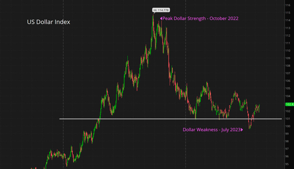
This is the DXY also known as the US Dollar Global Index which is a way of valuing the USD versus a basket of global currencies (as in, Euro, Pound, Yen, etc.). While this might not be predictive in nature, it is revealing. The pink annotation dates should look familiar but in reverse order from above. Said differently, while the tech stocks of the XLK were bottoming in October of 2022, the US Dollar was making new highs. It then dropped precipitously while those tech stocks rallied. Adding to the similarity of the charts, the “oops” from the XLK chart, where tech stocks started to rollover, took place right after the US Dollar started to break back above the grey line I added. A strong dollar has been a major “oops” for tech stocks. This does intuitively make sense as a strong dollar hurts companies like Apple and Microsoft who have a global footprint. Again, over a longer investment time horizon, these moves ebb and flow to work themselves out. However, in the short-term, they are useful to help make sense of what is happening out there in that big, round world.
We have a couple of quick things below otherwise that’s it for this week. We are always looking for feedback or ideas on what you would like covered in this blog so feel free to fire away. If you have specific questions, we are here to help. All the best.
<<< HIGH NOTE HITS >>>
Johnson & Johnson Unhitches the Wagon
- Johnson & Johnson has been working on a plan to relinquish the majority of their ownership in Kenvue at the right time. That time is now. Kenvue is a new, publicly traded company that’s composed of many former brands of J&J like Tylenol, Band-Aid, Neutrogena, Accuvue, etc. The idea with this company bifurcation is to get the consumer brands in one vehicle so the historic J&J can focus on pharmaceuticals and medical devices. This does make sense as trying to have a bunch of different business lines under one roof is not favored by investors (see what happen to General Electric over the past 20 years). As J&J shareholders, we have the right to exchange shares for Kenvue shares which you have received emails on. You can disregard. We are hoping with the smaller overall market cap of the legacy company after the split-off of Kenvue, they will return to the days of innovation and growth.
Get Real Estate
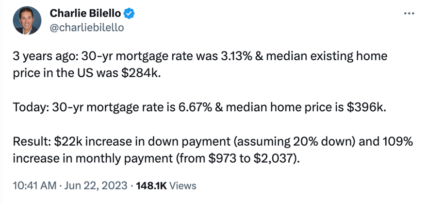
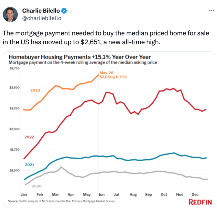
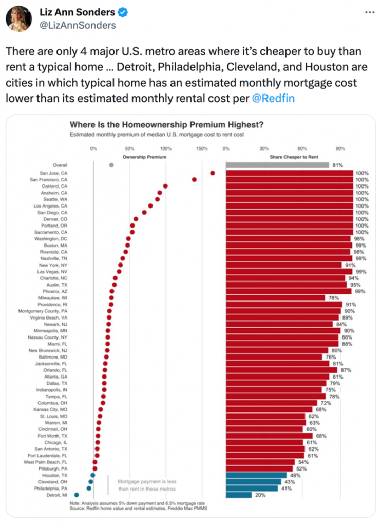
- The longer it takes for prices to correct the less likely it is to happen, right? Maybe…but yeah, that’s probably fair. The housing market is still mainly skating by on super low volume which has kept price corrections at bay – a win is a win. However, when you look at the numbers below of average rates, prices, and monthly payments it feels like prices have to give in a little. Interesting insights from Mr. Bilello and Ms. Sonders on the topic.
This is the DXY also known as the US Dollar Global Index which is a way of valuing the USD versus a basket of global currencies (as in, Euro, Pound, Yen, etc.). While this might not be predictive in nature, it is revealing. The pink annotation dates should look familiar but in reverse order from above. Said differently, while the tech stocks of the XLK were bottoming in October of 2022, the US Dollar was making new highs. It then dropped precipitously while those tech stocks rallied. Adding to the similarity of the charts, the “oops” from the XLK chart, where tech stocks started to rollover, took place right after the US Dollar started to break back above the grey line I added. A strong dollar has been a major “oops” for tech stocks. This does intuitively make sense as a strong dollar hurts companies like Apple and Microsoft who have a global footprint. Again, over a longer investment time horizon, these moves ebb and flow to work themselves out. However, in the short-term, they are useful to help make sense of what is happening out there in that big, round world.
We have a couple of quick things below otherwise that’s it for this week. We are always looking for feedback or ideas on what you would like covered in this blog so feel free to fire away. If you have specific questions, we are here to help. All the best.